POLL: Would the "letter grade" label confuse buyers?
Read results of our previous EPA sticker poll
The Environmental Protection Agency (EPA) and the Department of Transportation (DOT) have unveiled two proposed fuel economy labels that would appear on the window stickers of new vehicles, including one design that assigns letter grades from A+ down to D to indicate the vehicle's fuel economy performance. If adopted, the new label would mark the biggest change to the fuel economy sticker in 30 years.
"The old petroleum-centric labels just aren't good enough anymore," National Highway Traffic Safety Administration chief David Strickland said at the new label's introduction on Monday, August 30.
The new labels are necessary because of the increasing number of electric and plug-in hybrid vehicles that are entering the marketplace, according to the EPA. Since these vehicles use fuel more sparingly — or not at all — new methods of calculating fuel economy are needed, the agency said. The EPA is seeking consumer feedback during a 60-day period to help it decide what elements work, and ultimately which designs to incorporate into the final label.
"We are asking the American people to tell us what they need to make the best economic and environmental decisions when buying a new car," EPA administrator Lisa P. Jackson said in a press release. "New fuel economy labels will keep pace with the new generation of fuel-efficient cars and trucks rolling off the line, and provide simple, straightforward updates to inform consumers about their choices in a rapidly changing market. We want to help buyers find vehicles that meet their needs, keep the air clean and save them money at the pump."
The label design with a letter grade immediately came under fire from auto industry groups. On its Web site, the National Automobile Dealers Association (NADA) said that it will "likely oppose any proposed label design that would mandate a letter grade for a vehicle's overall fuel economy and greenhouse gas emissions performance." NADA argues that the letter grades would confuse the buying public, make vehicle purchasing decisions more difficult and treat certain automakers or fuel types unfairly.
Dave McCurdy, president of the Alliance of Automobile Manufacturers, also was critical of car grading. "The proposed letter grade falls short because it is imbued with school-yard memories of passing and failing," McCurdy told The Wall Street Journal.
The two proposed designs contain mostly the same information, but it is presented differently in each. The label to which NADA and the Alliance of Automobile Manufacturers took an instant dislike does indeed prominently feature a letter grade that is based on the vehicle's fuel economy, and if adopted would be a major departure from the current sticker. The second label more closely resembles the current version, but adds more information to reflect new methods of calculating fuel economy. The EPA expects to make a decision by the end of the year, and the new label will first appear on 2012 models.
In order to accurately report the fuel-efficiency of all vehicle types, both versions of the proposed label would have alternate versions based on the type of fuel that powers the vehicle. Electric vehicles would display a miles-per-gallon equivalent (MPGe) and calculate savings based on the cost of electricity. Vehicles that can operate in gasoline and electric modes would have two separate ratings within the label, indicating the range and mileage of each mode. Both labels will display the methods for calculating fuel use in gallons per 100 miles (or kilowatts per 100 miles) as well as tailpipe emissions levels. Finally, both labels would include a barcode that a person at a dealership could scan with a smartphone to quickly obtain more information.
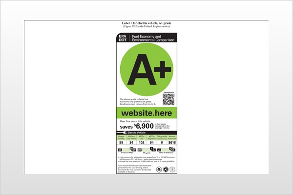
Label 1: The Report Card
This label has a vertical layout and features a letter grade surrounded by a stoplight-inspired colored circle. The letter grade and color of the circle will change to reflect the vehicle's fuel economy. The highest grade is A+ and the lowest is D. The EPA says that no vehicle will get an F, because all vehicles need to meet a minimum federal standard.
Here are a few examples of which vehicles would earn the proposed letter grades. (The EPA did not list an example for each grade):
A+ grades would go to electric vehicles. An example would likely be the Nissan Leaf, although the EPA and NHTSA said at its unveiling press conference that they have not yet given a fuel economy rating to the Leaf.
A grades would go to plug-in hybrid electric vehicles like the Chevrolet Volt. The Volt also has not been rated by the EPA.
A- grades would go to the more fuel-efficient hybrids like the Toyota Prius.
B+ grades would go to less fuel-efficient hybrids like the Nissan Altima Hybrid.
B- grades would be the median grade for most vehicles.
C grades would potentially go to SUVs, trucks and cars such as the Chevrolet Corvette.
D grades would go to high-performance (and low fuel economy) vehicles such as the Ferrari 612 Scaglietti.
The "report card" design also displays a five-year fuel-savings figure. This number shows how much money a consumer would save in five years compared to the costs of fueling an average vehicle. If the vehicle is less fuel-efficient than the average car, the figure would be red and would instead list how much more a person would spend on fuel over a five-year period.
The auto industry is concerned about consumer knee-jerk reaction to the letter grading, and it may be that car dealers and manufacturers would have to mount their own education campaign. They might need to ensure that an uninformed consumer who sees the grade doesn't interpret it as a judgment of the vehicle as a whole rather than a ranking of its fuel economy.
Another potential drawback is that the letter grade could steal the spotlight from more pertinent data. The critical fuel economy numbers are two-thirds of the way down the label. And the combined miles-per-gallon figure — a number that more closely indicates what a person would expect to see in the real world — is in small print even farther down the label.
Label 2: The Sliding Bars
This label has a horizontal layout and a more traditional design. However, it does display the information differently from the label that's currently in use. The combined mpg is now the first — and largest — number a consumer would see. The city and highway mpg numbers follow it. Below this is the figure for gallons per 100 miles.
To the right of the mpg numbers is the annual fuel cost. This differs from the "report card" because it shows fuel cost rather than fuel savings. Instead of a letter grade, the second label design has two sliding bar graphs to illustrate how the vehicle compares to others in terms of fuel economy and environmental impact.
The first slider shows how the vehicle's combined mpg compares to all vehicles and also within the range of its vehicle type — all SUVs, for example. The second set of sliders focuses on the environmental impact of the vehicle and how it compares to all others.
One bar depicts the combined city and highway carbon-dioxide (CO2) tailpipe emissions rating. The other bar shows the tailpipe emissions rating of factors that contribute to local and regional air pollution. It should be noted that neither label factors in "upstream emissions data," which is the pollution caused by the generation of electricity. This is another controversy that the EPA has to sort out, but here's an example of the quandary: Does an electric vehicle still earn an A+ if the electricity used to charge it comes from a coal-burning power plant?