A good paint scheme may not register at the forefront of everyone’s thoughts when they see a race car, but a well-executed paint scheme does register subliminally. Visual stimulation impacts people more than they realize. A great paint scheme can be a team’s stealth weapon for attracting attention.
Colors, logos, accents, and outlines affect the perception of a race team and its sponsor. Seriously, would people want to watch a field of white cars with generic black letters? Would the Intimidator have been as intimidating in a pink and yellow car? Heck no.
The fundamentals of good design can be applied to any race car from Winston Cup to Pony Stock. The artists who create outstanding designs all have little things they do to create a big impact. To help you make an impact the moment you hit the track, we consulted the most prolific designer in Winston Cup, Sam Bass, and other relevant professionals to get the inside line on what makes a paint scheme “work.”
Part 1: Introduction to Graphic Design With Professor Sam Bass
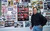
Bass is best known for his paint schemes and graphics for many of the top teams in NASCAR Winston Cup and the Busch Grand National Series. In the 2000 season alone, 11 Winston Cup and eight Busch drivers sport designs by Bass. He designs the cars, the transporters, the uniforms, and the helmets. He’s also well-known for his driver illustrations, having gained notoriety for those works of art in the early ’80s. Bass designed his first Winston Cup car in 1988—the #12 Miller Buick driven by Bobby Allison. Since then, he’s created more than 100 paint schemes for top teams in Winston Cup, Busch, Craftsman Truck, the Indy Racing Northern Light Series, and the National Hot Rod Association. Highly recognizable and successful drivers such as Jeff Gordon, Dale Earnhardt Jr., Steve Park, Tony Stewart, Sterling Marlin, John Andretti, and others drive cars with his designs.
So what defines a good paint scheme, according to Bass? “Obviously, you want something with a good visual ‘pop’ on the racetrack,” Bass explains. “You want something that the fans are going to find exciting and consider a neat-looking race car. The car needs to look fast while sitting still. After a while, if you just see the graphic elements of the paint scheme (somewhere other than on the race car), then the fans should be able to identify the sponsor just by (recognizing) the graphic elements.”
For example, when a person sees a certain rainbow pattern in neon colors, DuPont often comes to mind. After a while, the word “DuPont” isn’t even necessary on the car for people to associate it with the sponsor. When Bass designs a race car, he starts by spending time with the client to figure out what it wants to accomplish. He picks colors based on the sponsor and obtains the company’s graphic-standards manual that explains what can be done with its logo. Bass submits four or five designs that incorporate the logo in a way he thinks will be successful on the track.
The process is much more involved than just taking an existing car and sticking the corporate logo on the hood. Bass explains that each race car is unique, and a suitable graphic for it requires different elements than other types of products. A race car needs to be distinctive from distances of up to 1½ miles away, and it must show up well on television. There are situations where certain artistic liberties should be taken with the logo to make sure the sponsor gets what it is paying for (more on this later). Ultimately, there’s a readability factor for creating something that can show up well on television and in print. The sponsors that allow Bass to push the envelope and grant full artistic license with their logos often receive the most effective paint schemes.
The Colors of Racing
The same concepts Bass applies to his Winston Cup designs can be applied to virtually any race car. The biggest factor in creating an effective paint scheme that really “pops” is to use highly contrasting colors. This means using light colors on a dark background or vice versa. He considers three colors to be the minimum for the body, including decals and accents. Is there a maximum? Not really; it just depends on how well those colors are integrated before the car starts to look cluttered.
For example, black and white are the ultimate contrasting colors. Meanwhile, black and blue provide much less contrast. Red and black have the same color density, which doesn’t contrast well at night or in black and white photographs (such as in a newspaper).
However, making generalizations that some colors simply won’t work together is misleading. More importantly, the position of colors next to others and the use of outlines determine what colors work effectively together. Many fine examples exist in racing of colors that do not contrast well (like black and red, or green and orange). The reason they work, or pop, is due to the smart use of accent colors which basically put a high-contrast barrier between the two non- contrasting colors. Bobby Labonte’s Interstate Batteries Pontiac uses a green background with reddish-orange lettering (orange and green result in weak contrast and can create a blurry vision effect when used without a border). The green Interstate Batteries car works because the orange lettering has a white outline and is further accented by another black shadow outline.
Bass considers one of the cleanest designs on the racetrack to be the black #3 Goodwrench car of Dale Earnhardt. It effectively demonstrates the power of good accent colors. The overwhelmingly black car has white, silver, blue, and red accents. The red accents around the lettering make it pop out. The white letters wouldn’t have the same effect without the red outline around the “3.” Furthermore, using neon colors can greatly improve a paint scheme’s visibility. Most people perceive colors used on race cars to be ordinary green, yellow, red, and so on. Actually, those colors are usually neon variations of the standard. When picking colors, keep that in mind. However, be warned—there’s a fine line between effective and obnoxious with neon, so don’t overdo it. Also, avoid using shades of the same color throughout the car. From a distance, the colors will appear practically the same. In the shop, it just means more work and more paint.
When using a sponsor’s colors, consider upping their brightness level. Instead of using a sponsor’s color of red, use a similar yet brighter red. Up close, the car will seem more dramatic. From a distance (and on TV), the car will show up better and balance out to the normal brightness (if the brighter colors were chosen without going overboard). The bottom line: It will still look like the sponsor’s color of red to 99 percent of the people. “I’m not talking about going crazy; I’m talking about subtle manipulations,” says Bass. A good tool for choosing con- trasting colors is the color wheel. It plots the colors of the rainbow in a circle with the most contrasting colors positioned opposite of each other. People with art backgrounds know it by heart, but if you’re not artsy, this can help.
Be Different
At the Saturday-night level, nearly everybody is looking for a sponsor. Getting noticed is just as important to a racer seeking sponsorship as it is to a sponsored team. When you look at a field of cars at any local track, the majority seem to be white, black, or red. If you’re designing something new and want to stand out, do some research at the track (or within your series).
Design something completely different from anything there. And don’t limit the color choices to black, white, or other common colors. Try orange if no one else uses that color. The argument can be made that an unsponsored car should use conservative colors that can adapt well to a wide variety of potential sponsors. However, getting noticed first is the top priority, so give yourself an edge over the competition. Would the cost and hassle of changing a paint scheme to accommodate a new sponsor be worth it? Ask your credit card. Bass’ golden rules for paint-scheme design center on being graphically creative, maximizing contrast, using a professional decal person, and studying the competition. He urges against using what other people have done and skimping on quality.
Part 2: Designing a Winner
For this section, we’ve drawn on more experts from a wide range of backgrounds. Contributions from Bass, Chad Martin at The Decal Source in Greensboro, North Carolina, and Kyle Griffin of Griffin Studios in Burbank, California, helped us create a guide for the Saturday-night racer.
Major Considerations
Overall, a good paint scheme needs readability, consistency, and ease of maintenance. Readability refers to logo sizing and color combinations throughout the car. Consistency can be achieved using decals of the same color, similar fonts, and not altering a team’s “look” sporadically. Ease of maintenance refers to the ability to fix a paint scheme after a wreck. Complex paint schemes take more time to paint and are more difficult to repair. By using solid colors in key crash areas, the car can spend more time getting fixed and less time getting painted.
The Basic Design
Creating the basic design is a process. Don’t expect to take a piece of paper and design the car in one quick session. Artists like Bass and Griffin might create a dozen designs before they find four they consider worthy of presenting to the client. A successful design marries the team to the sponsor. Blending the sponsor’s identity into the design of a race car is where the artists’ skills come into play. Martin recommends studying the sponsor’s print advertisements, Web site, and products to help integrate the race car with the company’s marketing.
Initial designs range from conservative to extremely wild. To start, they create a blank car on a piece of paper and use that image over and over. It can be hand-drawn or traced from a photo. Some designers use computers to create paint schemes. A computer allows for small tweaks to be made without having to redraw the entire car. It’s an efficiency tool, but not a required one.
A complete paint-scheme sketch shows the car from five angles: front, top, passenger side, driver side, and back. Tip: Photocopy the original blank outline many times. If you’ve never designed a paint scheme, you probably haven’t noticed this detail. The left-side graphics are significantly different when compared to the right side. Each side requires a unique design because the letters from one side would be backward on the other side. Since words and letters must read from left to right, the decal designs need to be custom-fit for each side. Because people never see both sides of the car at the same time, it’s OK to fudge a little on this. Unfortunately, a design that looks great on one side doesn’t always translate well to the other; in that case, it must be scrapped.
Designers sketch out various designs based on what the sponsor and/or team wants. They add color with magic markers or colored pencils. The process can become complicated. With a basic concept in mind, they map out numbers, logos, stripes, scallops, lightning bolts, barbed wire, fades, checkers, and any other design element imaginable. While juggling those details, the use of color and how to maximize contrast must also be considered. Some primary sponsors want the associate sponsors to be separated by design elements so that no confusion is possible.
The contingency sponsors occupy much of the front fender space, so that area is usually one solid color. The fenders lead to the topic of ease of maintenance. To decrease the cost and time of painting the car, areas prone to bumping and “racing” generally receive solid colors (no zebra stripes, lucky stars, or complicated paint treatment near wheelwells, bumpers, or other accident-prone areas). If stripes or something similar become a design element, then keep in mind that decal colors need to built around those stripes. The bottom of the car is important, too. If a dark car races on dark asphalt, then the car blends into the track. A light color strip around the bottom of the car will contrast with the track, allowing the car to obtain some of that elusive pop. When Griffin shows his designs (on 8-½x11-inch paper), he lines them up on a wall and stands back 10 feet. The first one that catches his eye usually has the most “pop” and is his first choice.
Sponsor Decals
Placement and size determine the effectiveness of decals. Of course, certain parts of the car are better than others. When placing logos, consider the type of media exposure the car will receive. The prime real estate on the hood, the rear quarter-panels, and the bumper represent the bulk of usable space for most cars. The area surrounding the windows is good, too, because photographers like to snap pictures of drivers strapping into their cars.
Within those spaces, placement and size become a major issue. For example, the lower part of the hood gets more exposure than the top. Decals on the lower part of the hood can be seen head-on, from above, and through in-car cameras. That’s just one example, but the point is that placement within certain areas can make a huge difference in exposure.
Moving on, size does matter. Logos need to be as large as possible within the space they occupy. As Bass explained earlier, a corporate logo in original form does not often lend itself well to a race car. A simple fix is to distort it by stretching its length and/or width.
Decal design is an area in which Martin at The Decal Source specializes. He likes the major decals to occupy “clean space,” or not cross over multiple background colors. When choosing fonts for decals, he recommends standard block typefaces—not serif fonts, which have distracting curves at the tips of the letters. Using block-type fonts doesn’t mean the letters can’t have character or be in italics. Big, block-style fonts are simply easier to read from far away. Of course, a sponsor’s font should be used whenever possible; however, an italic font may not look pleasing on the hood, but it may work better on the sides to convey speed.
Furthermore, borders and shadows allow decals to show up much better than just a plain decal against the base-color paint. One technique that adds a dimension of color is to utilize an “inline void.” An inline void is essentially a cutout which allows the color of the paint to integrate into the composition of the letters. It essentially turns a two-color decal into a three-color decal. (See photo of the Pro Shop decal.) The ultimate goal of decal design centers on getting the most visibility for the sponsor—not on preserving the integrity of a corporate logo. The logo should definitely carry over strong elements from the sponsor’s identity, but it doesn’t have to be an exact reproduction.